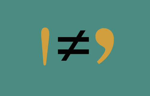
Say What You Mean
I am amazed that in 2010 I am still encountering foot marks masquerading as apostrophes in printed materials. Considering the cost of an ad in The New York Times, you’d think they’d get it right. This ignorance is surely a legacy from when the PC eliminated the informed work of seasoned typographers.
And what amazing work they did. You would “spec†up a page of text to fit into a brochure or ad, confident that you were in good hands. Copy that shouldn’t have really fit in the space you had assigned it, not only lived comfortably there but was beautiful, too.
However, once the ubiquitous computer became the typography engine of our layouts, we were expected to take over. Many designers took up the challenge, using their Macs to work up ideas that previously had been difficult or impossible to realize.
There was a year during which we were all informed that since there was a layout program called Pagemaker available, our services were no longer required. Administrative assistants were enlisted to create brochures and logos, throwing into question everything we knew or were taught about marketing materials communicating something intrinsic about the company that issued them. Eventually, designers were brought back to the table, but the damage was done. The availability of all kinds of software now meant that companies would see their computers less as tools than employees. (I think we could probably call its current visual manifestation “the PowerPoint aesthetic.â€)
There’s another ingredient at work here—and one not necessarily negative. With today’s availability of inexpensive and sophisticated electronics, the 70s do-it-yourself approach continues to live on. The DIY means-to-an end often embodies a challenge to a prevailing set of rules, resulting in some odd combinations—often strange, but usually interesting. Their challenges to traditional typography sometimes even take the form of radical transformation of letterforms. That is not say that some pretty stupid decisions aren’t made under the DIY banner.
So what is this rant all about? Â Intention. That is what design and communication are all about.
Tags: ads, computer design, DIY, intention, layouts, typography

May 27th, 2010 at 1:36 am
Occasionally I have had a client cop a “don’t be a fussbudget” attitude when I objected to bad typography, including the inch-marks-for-quotation-marks issue. And you know, they are everywhere now — I frequently see the “dumb quotes” on signage. I fear that as soon as ten years from now they will accepted as standard. Really.
I never wanted to be one of the old-timers ranting on the sidelines about the loss of standards, godammit. But I guess we can rant together!
May 27th, 2010 at 8:55 am
Rob, great post. I rue the day typography morphed from the hand-crafted artisanship of the great master type designers to the digitized stretch-it-any-way-you-can-to-make-it-fit approach nowadays. Even when I find myself guiltily indulging in my own on-screen manipulations, a little voice in my head is saying ‘sorry’. And while we can’t turn things back around, maybe what we can do is learn to better appreciate the history and the art of letterforms, and use it to somehow inform our ‘intention’ in the work we do.