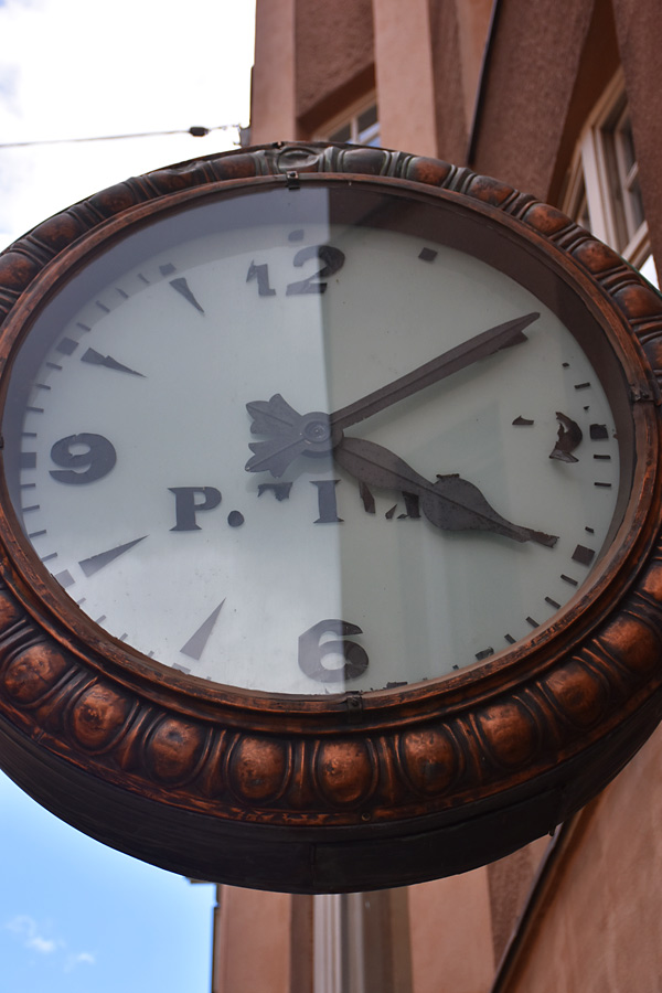
Time, as measured in Helsinki
July 24th, 2017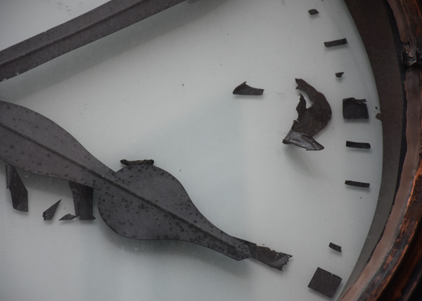
Too often we rush through an exhibit and decide within a second or two if a work is worthy of more attention. Are we using the right language to make a judgement, or have we never acquired the tools for negotiating the visual unfamiliar in the first place? We take for granted that the eyesight most of us have been granted arrives with the same filters and “instructions†for interpretation, but the lack of an education on how to read—or at least enter—a work of art forces some of us to respond only viscerally to new work. Without some degree of  comfort with this language, we ignore art that has the potential to captivate and enrich. We don’t stop to look because of the difficulty of making judgements about how the work communicates its intentions and how original—or even unique to the artist—the piece is. By this, I mean two things.
The first are the formal elements that allow us to “diagram the sentence.†We understand the roles that nouns, verbs and prepositions play in our ability to express ideas, but many of us are clueless about the architecture of a visual sentence. Some depend on shorthand phrases, learned in an art history course or absorbed through culture, to help them navigate. Learning to understand how these are put together to construct bigger and more complicated ideas—first a sentence, then a paragraph—takes commitment, but repeated direct encounters with art can help you engage in deeper ways. Is that shape in the painting attempting to describe a three-dimensional object? How is color affecting the way I understand this piece of sculpture? Why are these two very different objects displayed side-by-side? And so on.
The second is the personal visual vocabulary that marks a piece as the work of a particular artist. Recognizing an artist’s “accent†is not just a quick way to establish what might be at play in a piece because of its connection to a particular time period or school. If you know the artist, it is also a way to establish a dialogue between any past work with which you are familiar and the new work you encounter, and that itself creates another dimension of insight. Your understanding deepens because you are not just comparing the work to all art, but drawing conclusions based on decisions that the artist has made—or not made—in the past. You can build this new responsive muscle, exercising your eyes and mind, by sharing a space—and time—with actual artwork.
I know that enlarging your vocabulary is a difficult task, but I have what might seem like a counter-intuitive suggestion. The next time you are at a museum or gallery, look for art that disrupts your assumptions or offends your sensibilities instead of work that calls out to you. Instead of rejecting it out-of-hand, spend some time with it. Your struggle to find meaning, together with the time you put into it, will reveal things that a quick walk past it never can. It might change how you conduct a subsequent visit to a museum. It will certainly have given you a new experience.
An exhibit at the Harvard Art Museums currently has a tease of an exhibit by the Colombian artist Doris Salcedo. Why a tease? Because we are shown only a few of her pieces. In this case, that turns out to be a plus if this is one’s first encounter with the work—it gives one permission to spend time with the pieces, make connections, and ask questions. The way in which the work is displayed contributes to being able to really look at them—the rooms are of a size that provides plenty of space around each piece, performing the double duty of inviting one in and letting the focus stay on the art. Each series is contained in a single room, but the arrangements suggest understandings based on seeing the pieces both as individual works and together as a complete whole.
The artist’s themes include victims, oppression, political violence, and war, but one does not need to aware of the art’s pedigree to make larger connections to a world in which aggression and greed rule the day. There is a real, physical presence to the work that makes the viewer aware of not only the kind of force that forges new relationships, but also the existence of absences—perhaps a different type of evidence of the same thing.
Too often, art that concerns itself with commenting on social injustice employs the tools of a documentarian—images, documents, and other types of “evidenceâ€â€”to assemble an experience for viewers of the work. The results are often confusing, since it often appears to be delivering information intended to educate, and at times, promote a specific course of action. Something you’d expect from a news source or political group because of the language it uses.
This is not that. Here, the suffering and confusion of a world operating in the absence of a common morality is turned into poetry, which allows one to take full responsibility for a reaction. Or perhaps, engage in no reaction at all.
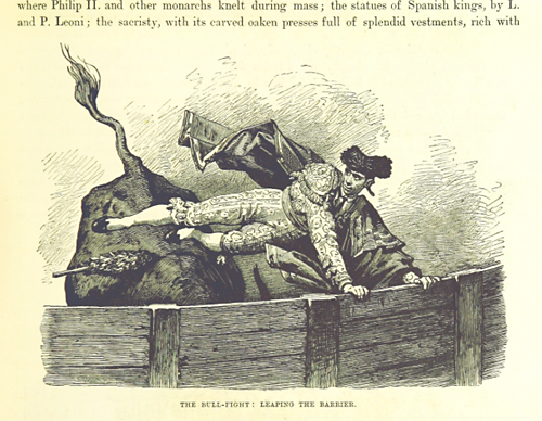
Image from ‘Cities of the World: their origin, progress … Illustrated’, by Edwin Hodder. (1881)
It is rarely the case that the name of something and what it does are equally delightful. I’ve just discovered The Mechanical Curator, a tumblr blog that every hour at random selects and makes available an image from a collection of digitized images at the British Library. These scanned images come from the pages of 17th, 18th, and 19th books in their collection, and may be used without charge under a Creative Commons license.
It replicates, to some extent, the pleasure of discovery associated with roaming the stacks of a library while being wholly open to whatever one encounters. The regular arrival of the unexpected is quite a pleasure—in this case, everything from the mundane and the humorous to the solemn and mysterious. The context isn’t always immediately apparent, forcing one to look hard at what’s been delivered. Much joy in that, too.
The University of Texas Press just published a book entitled Flatbed Press at 25. It provides a history of the founding and operation of Flatbed Press—a collaborative printshop located in Austin, Texas—with reproductions of prints and of artists and master printers working together. The press was started by Mark Smith and Katherine Brimberry twenty five years ago, and it is that milestone the book celebrates.
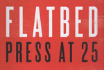 Flatbed Press at 25 makes a strong case for the press’s importance with lots of visual evidence—we are treated to a quarter century’s worth of wonderful prints, arrived at through the open engagement of artists with master printers. And, as the book argues for Flatbed’s place in the national context, it reveals that the press has all along provided unique opportunities for artists connected with Texas in one way or another, furthering many careers over the years. In fact, it has even promoted them with their collection Flatbed Portfolio I, a set of prints by nine “Texas artists.â€
Robert L. Levers, Jr., “Victory: The Celebration,†intaglio print. 1991.
One reason—among many—that I am happy with this book is that it includes a section on my father, Robert L. Levers, Jr. The last print he ever made was done at Flatbed the year before he died—a huge soft-ground etching and drypoint work entitled Victory: The Celebration. It hangs in my office right behind me, and does not cease to call out to visitors or invite my own explorations of certain areas of the print during my workdays.
Nice to see a book that so lovingly provides insight into a unique studio and the artists that have spent valuable time there.
My father, the artist Robert L. Levers, Jr.
A number of years ago, I wrote a short history of my father’s artistic life. I’ve included it here:
Much of the imagery in my father’s last work would not look out of place in contemporary news reports. In fact, the paintings, prints and drawings—most inspired by a dream about the football stadium at the University of Texas under attack—could be said to be prescient in their focusing attention on themes which will surely be haunting us for some time to come.
Originally from the east coast, he spent his productive artistic life in Austin, Texas. Before he arrived to teach at the University of Texas, however, he studied at Yale, the art department of which was undergoing great change at the time—his undergraduate years provided not only something of a Beaux Arts experience, but also included study with Josef Albers, the former Bauhaus teacher and artist who developed the famous color course. A stint in the Navy between the two degrees helped pay for his graduate education, thanks to the G.I. Bill.
He was primarily known as a painter, but he produced work in a range of mediums, including drawings, prints, and at one point, constructions made of drawings in gouache on cutout pieces of wood arranged into scenes of conflict.
He made the most of sabbaticals—time spent in Mexico City not only exposed him to the Pre-Columbian art at the Anthropology Museum but also to the smog that hung in the former lakebed in which the city was founded, both of which affected the content of his work. In 1980, a National Endowment for the Arts Fellowship made possible a year in New York City focused solely on work and visits to galleries and museums. Four years later, he participated in the Venice Biennale as a representative of the United States, then traveled to Europe for the first time, spending four months viewing exhibits in many of the major cities of the continent while traveling with a beat-up suitcase dedicated to museum publications.
His work obliquely referenced the turmoil of current events, though at times the treatment of these themes seemed almost comical—it is that tension that animated some of his best works. In 1992, he died from a heart attack suffered in his garden. At the time, a retrospective of his work was traveling to different cities in Texas.
I’ve been a little busy, so you haven’t seen anything from me in this space for awhile. What I have been working on? A new company called Assabet Interactive that provides software to libraries to make it easier to serve their public on their websites. My interest in design—in the biggest sense of the word—was what led me to form a partnership with a programmer to fill a need we saw as unmet: the clean, intuitive delivery of functionality around an event calendar with registration, meeting room reservation, and museum pass check-out on library websites.
![]() Assabet Interactive was just at the New England Library Association in Danvers, Massachusetts to announce that, after almost two years of talking to librarians, designing an approach, and building out the modules with a common administration section, we are ready to deliver on our promise of tools that make it easier for both patrons and staff to engage in some of the core services every library provides. You can see our calendar and room reservation system on the Goodnow Library site.
Assabet Interactive was just at the New England Library Association in Danvers, Massachusetts to announce that, after almost two years of talking to librarians, designing an approach, and building out the modules with a common administration section, we are ready to deliver on our promise of tools that make it easier for both patrons and staff to engage in some of the core services every library provides. You can see our calendar and room reservation system on the Goodnow Library site.
In subsequent posts, I’ll go into some of the details that make our software different. And, off course, comments on some of the interesting music and art I encounter.
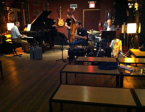
Matchbox: Pandelis Karayorgis, Nate McBride, Jorrit Dijkstra, and Curt Newton performing at the LilyPad in Cambridge, MA on June 4, 2014.
If there is strength in numbers, Driff Records is taking a stand against the general indifference with which improvised music is met in the Boston area. That is not say that there are no enthusiastic supporters of the music here, but over the last couple of years a stack of recordings on the relatively new label—often local artists working with musicians from other cities in the U.S. or Europe—is asking the world to pay more attention. In fact, the albums are a public statement about connections and sympathies that have existed for years.
The label was founded in 2012 by musicians Jorrit Dijkstra and Pandelis Karayorgis in 2012 to release “transatlantic†improvised music. They are both from Europe, so the emphasis on music with feet on both sides of the “pond†should come as no surprise.
On Friday, July 18, the Second Annual Driff Fest (and CD release party) at the Lilypad in Cambridge will be featuring many of the bands on the label: Matchbox, Bolt, Tony Malaby, and the Driff Large Ensemble. That translates to many of the best improvisers in Boston. For more information, check their website. You have your marching orders.


How about a history for the operating system? Each “state†would visit an application—in order of usage—showing the most recent version of the document that was open at the time of closing. It would also save this history by calendar day, for referencing later. That could be very useful for locating documents for which you’ve forgotten the names, as well as reminding you of what you worked on in any given day. Who do I call?