Posts Tagged ‘typography’
Virtual Letterpress for the iPad
Wednesday, March 2nd, 2011Kickstarter is a website that helps creative projects get off the ground with their online fundraising. Many of these you’ve never heard of—and probably won’t, even after they’ve successfully raised funds and launched.
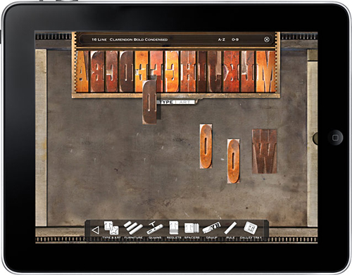
One project that I think you will is from a company called LetterMpress—they are working on a virtual letterpress for the iPad. The interface mimics the actual process of this old way of setting and printing type, resulting in a great “print” when you’re done.  Even if you don’t have an iPad—I don’t—you should check out the video on Kickstarter—you might be inspired to contribute!
Iranian Typography
Monday, February 21st, 2011
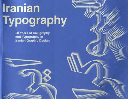
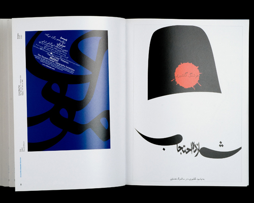
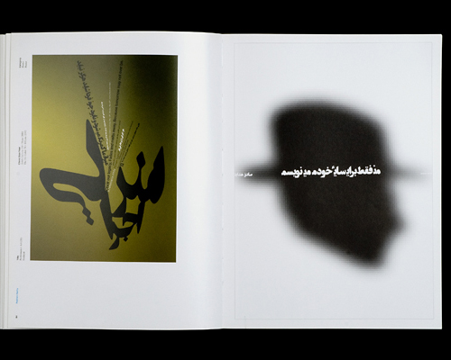
A recent posting on the imprint: EXPANDING THE DESIGN CONVERSATION blog calls our attention to a new book on Iranian typography. As a designer practicing in the United States, it’s often easy to forget about opportunities provided by letterforms different than the ones we use every day. A few years ago, I was lucky enough to see some posters—I believe from Iran, as well—at the Boston Center for the Arts’ Mills Gallery. Some of these took advantage of the idea of type as object—certainly not unfamiliar to audiences here—but with the calligraphic feel of the Persian characters, the effect was often profoundly different.
The catalog is the result of a relationship between Iranian designers and the Basel School of Design, showing 50 years of logo design and posters from the Iran. That’s a lot of history, especially when you consider that the first examples come from a very different world—one in which the country was under the rule of the Shah and much more connected to interests in the West. Looks like this book is worth a good look. More information from the publisher is here. Copies can be ordered from Amazon here.
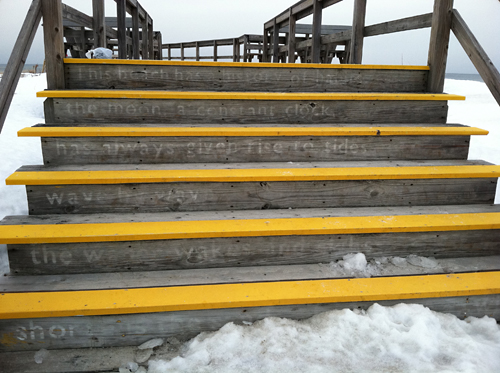
Characters: Poetry at the beach
Tuesday, February 15th, 2011Signposts #6
Wednesday, November 3rd, 2010Matthew Carter, MacArthur Fellow
Tuesday, October 5th, 2010Matthew Carter is one of the 2010 recipients of a MacArthur Fellows award. It is well-deserved recognition for his particularly intelligent and graceful solutions to typographic problems, a good number of which did not even exist at the beginning of his career. (Ink on paper works quite differently than an rgb monitor.)
As a type designer, his contributions are often viewed in service of the work of graphic designers. However, without the “tools†he’s developed, much of what designers do would not be possible in the same way. His work reflects a thorough knowledge of traditional styles, yet is in sympathy with the 21st century. He is responsible for the designs of over 60 typeface families and 250 individual fonts, including many you know intimately, if not by name.
His notable designs include Bell Centennial, a face which allowed the telephone company to reduce the size of the type while retaining legibility; Verdanna and Georgia, THE legible faces of the web; and many of the preferred versions of classics like Baskerville and Caslon.
Carter sees this award from the MacArthur Foundation not as recognition for a successful career coming to a close, but rather as encouragement to keep going. I look forward to next chapter.
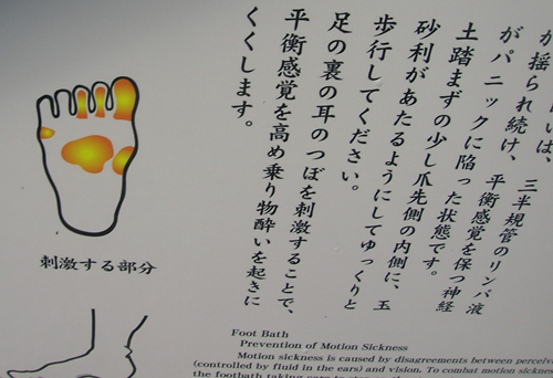
Some Words, What Meaning?
Friday, September 17th, 2010Signposts #2
Monday, August 2nd, 2010Say What You Mean
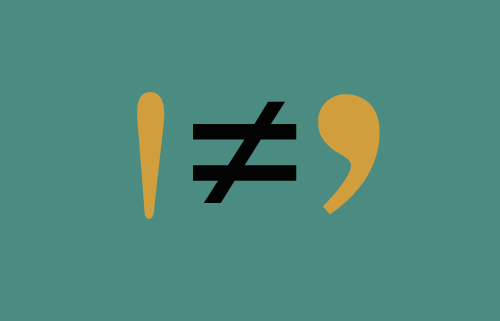
Wednesday, May 26th, 2010I am amazed that in 2010 I am still encountering foot marks masquerading as apostrophes in printed materials. Considering the cost of an ad in The New York Times, you’d think they’d get it right. This ignorance is surely a legacy from when the PC eliminated the informed work of seasoned typographers.
And what amazing work they did. You would “spec†up a page of text to fit into a brochure or ad, confident that you were in good hands. Copy that shouldn’t have really fit in the space you had assigned it, not only lived comfortably there but was beautiful, too.
However, once the ubiquitous computer became the typography engine of our layouts, we were expected to take over. Many designers took up the challenge, using their Macs to work up ideas that previously had been difficult or impossible to realize.
There was a year during which we were all informed that since there was a layout program called Pagemaker available, our services were no longer required. Administrative assistants were enlisted to create brochures and logos, throwing into question everything we knew or were taught about marketing materials communicating something intrinsic about the company that issued them. Eventually, designers were brought back to the table, but the damage was done. The availability of all kinds of software now meant that companies would see their computers less as tools than employees. (I think we could probably call its current visual manifestation “the PowerPoint aesthetic.â€)
There’s another ingredient at work here—and one not necessarily negative. With today’s availability of inexpensive and sophisticated electronics, the 70s do-it-yourself approach continues to live on. The DIY means-to-an end often embodies a challenge to a prevailing set of rules, resulting in some odd combinations—often strange, but usually interesting. Their challenges to traditional typography sometimes even take the form of radical transformation of letterforms. That is not say that some pretty stupid decisions aren’t made under the DIY banner.
So what is this rant all about? Â Intention. That is what design and communication are all about.


