Posts Tagged ‘computer design’
Space, and Silence
Saturday, June 5th, 2010
Too often we dismiss white space in art and print and silence in music as nothing. The reality is that it is very much something—as much a part of what we understand about the art we encounter as what we might call the substantive part. In fact, the absence of these “nothings†would propose very different readings of pieces before us.
In Josef Alber’s famous book, Interaction of Color, he talks about how colors do not exist in a vacuum. Individual colors are understood in context; that is, what surrounds a color is an important part of how we perceive it.
The same is true in music. Morton Feldman composed many pieces that forced his listeners to consider notes differently than usual because of the space with which he surrounded them. Remove them, and they become entirely different pieces.
Of course, the most famous piece about silence, 4’33” by John Cage, is not really about silence at all. It is about listening.
Besides the reverb which bathes each recording on the German label ECM, every one of their CDs start with 4 or 5 seconds of silence. In this way, the first sounds of the performance are heard differently than if they began instantaneously. That approach has another effect: it separates the music you are about to hear from the world of ordinary sounds. (Think of what we consider to be ordinary sounds these days as compared to 100 years ago!) It is the label’s way of setting the experience apart from normal life, should you choose to really listen. Not unlike what is attempted during the services in sacred buildings.
A print or drawing with a mat around it in a frame is saying the same thing: this is special—pay attention, and you’ll be rewarded. The “white space†of the mat helps to ensure that other elements in the area in which the art is displayed do not become part of the viewer’s experience.
Often I have clients tell me that I have an excellent opportunity to add more information to an ad or brochure because of the white space I have employed—usually used deliberately to make the piece more effective. The irony is that less will be communicated because it would have become more difficult for a viewer to enter and engage with the material. (In many cases, it is a question of the client not having gone through the exercise of deciding what are the most important messages to be delivered and wanting to cover all their bases: a case of too much is not enough.)
I’ve talked about the effect that these “nothings†have on the “substantive†part of things, but what about looking at it the other way around? The spaces and silences are all bordered by their opposite, and so are limited by their borders. Sounds like shapes to me—again, that’s really something!
Long live nothing.
Say What You Mean
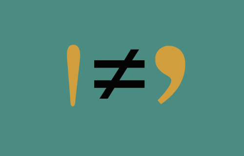
Wednesday, May 26th, 2010I am amazed that in 2010 I am still encountering foot marks masquerading as apostrophes in printed materials. Considering the cost of an ad in The New York Times, you’d think they’d get it right. This ignorance is surely a legacy from when the PC eliminated the informed work of seasoned typographers.
And what amazing work they did. You would “spec†up a page of text to fit into a brochure or ad, confident that you were in good hands. Copy that shouldn’t have really fit in the space you had assigned it, not only lived comfortably there but was beautiful, too.
However, once the ubiquitous computer became the typography engine of our layouts, we were expected to take over. Many designers took up the challenge, using their Macs to work up ideas that previously had been difficult or impossible to realize.
There was a year during which we were all informed that since there was a layout program called Pagemaker available, our services were no longer required. Administrative assistants were enlisted to create brochures and logos, throwing into question everything we knew or were taught about marketing materials communicating something intrinsic about the company that issued them. Eventually, designers were brought back to the table, but the damage was done. The availability of all kinds of software now meant that companies would see their computers less as tools than employees. (I think we could probably call its current visual manifestation “the PowerPoint aesthetic.â€)
There’s another ingredient at work here—and one not necessarily negative. With today’s availability of inexpensive and sophisticated electronics, the 70s do-it-yourself approach continues to live on. The DIY means-to-an end often embodies a challenge to a prevailing set of rules, resulting in some odd combinations—often strange, but usually interesting. Their challenges to traditional typography sometimes even take the form of radical transformation of letterforms. That is not say that some pretty stupid decisions aren’t made under the DIY banner.
So what is this rant all about? Â Intention. That is what design and communication are all about.


