Packaging, Discovery and Recorded Music
Monday, May 24th, 2010Unfortunately, as we acquire more and more recordings online as audio files, we are losing valuable information that can really add to our understanding of the music. Just as we think of milk as coming from the supermarket instead of the cow, now music is “made†by the web. I remember spending hours in record stores when I was young, looking at the lp covers and reading all of the information on the jacket as a way to put the music into context. (Of course, it was also great excuse to hang around and hear what was being played in the store—that’s how I heard the first David Grisman Quintet album when it came out in 1977.)
The searching for context could sort of be put in two categories.
1. Information that the record company wanted me to know. This was not always the most interesting or helpful way to get an idea of the contents inside the record jacket! The cover often used graphic design as a way to engage the intended audience’s demographic, and the notes on the back often indulged in so much hyperbole that it was easy to dismiss them as the blathering of the in-house marketing department. Some covers did become such a strong expression of the label that the opposite occurred—you began to trust it when you saw it. (The design of covers from sixties Blue Note and Impulse releases are good expressions of that—great branding cases, both, too.)
2. Information gleamed from another type of reading. Where was the album recorded? Who played on it? Who produced it? What label was it on? What instruments were played? Answering those questions often led me to a better sense of what I might hear and gave me a way to continue exploring if I liked what I heard. Sometimes, the takeaway was related to the consistency of presentation—when I saw a poor design job I often wondered about the quality of the actual recording, since they didn’t seem to have taken much care with the part that I could actually see.
I am in mourning for record jackets, though I have come to terms with CD packaging, even if don’t have the impact of the old lp covers. The visual face-off between the Beatles and the Stones with Sgt. Pepper’s and Their Satanic Majesty’s Request would have seemed much less important than it did if first delivered in jewel boxes. (At least they are portable.)
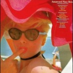
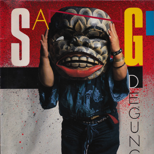
Perhaps the “packaging†for digital audio files is the Wikipedia entry, the MySpace page, and YouTube videos. If so, what’s missing is the actual promise of the old packaging. Many times I bought albums because the cover lured me in, not because I knew anything about the music. Often these records became favorites—an album of modern gamelan music with a short man wearing a huge mask on the cover, Amarcord Nino Rota, and Gal Costa’s “India†for example. Because I purchased them “sound unheardâ€â€”as opposed to hearing snippets online—I was invested in listening carefully to every note in order to decide whether I liked the music.
 The ability to hear snippets of music online is both good and bad—good, because you can get an idea of the music; bad, because you don’t get the whole idea. You make judgments quickly, and often unfairly. Given this mode of quick decisions, perhaps what we ultimately listen to is actually much more limited than before, despite the actual availability of a greater range of music.
So maybe there’s a design challenge here—how can we add a visual element to an audio file that that lets our imagination go to work?
