Posts Tagged ‘Design’

Origami Ukulele

Friday, May 18th, 2012

A freelance engineer who’s won awards for his mobile phone concept designs has taken his passion for origami and applied it to music. Brian Chan has invented a folding ukulele, made of laser-cut pieces of bamboo plywood. The engineering makes it even more portable than a normal ukulele. By disengaging the strings, one can fold the neck and headboard into the body of the instrument. The result—something that resembles a turtle—can be easily thrown into a pack. If you really want to connect with the design, there’s a kit available. Get details on where to buy it and watch him describe here.

51-State Flag Revisited

Wednesday, June 15th, 2011

Maybe I was just looking at this all wrong. (See my post of a year ago.)

Homes

Tuesday, June 14th, 2011

Most people don’t usually think of their yards as containing any structures other than their house, their garage (if it’s not attached to their home), and perhaps a garden shed. The nest in this pine tree got me thinking about how many buildings are actually on my property. I’ve tended to think of the animals and birds I’ve seen as visitors just passing through, though with the woodchuck, I think that’s just wishful thinking. Once you begin to look, you see that there is quite a range of design choices!


Agriculture by Design

Wednesday, July 14th, 2010
I just picked up my half-a-share from a CSA (Community Supported Agriculture) farm in my hometown. It takes only a few minutes to get there, and inevitably I return much happier than when I left. The smells of the fresh produce get me thinking of the all the things I can cook with my bounty, including many dishes I’ve never made before. (Ever used kohlrabi in a recipe before?) But the really, really big thing for me is the taste—the objects found in the fruit and vegetable section of the supermarket are another species than what is in my box.

It didn’t used to be that way, but “designing” vegetables for shipping and storage means that taste takes a back seat. Am I happy that I can eat fresh vegetables in the winter in the northeast? Sure, but it’s pact with the devil, since now even in the summer most vegetables in the summer still have the wrong texture and no taste when bought at the supermarket. (It’s not a surprise that lots of kids won’t eat their vegetables!)

There’s a way we can design the taste back in—support your local farms.

Design Question: Statehood for Puerto Rico?

Thursday, June 24th, 2010

Puerto Rico. Palm trees. Beaches. Sun. Rum. And almost 4 million people—about 1,000 people per square mile. At the end of the Spanish Civil War, the island was ceded to the U.S., and though the people of Puerto Rico were all made U.S. citizens in 1917, they’ve lived in an incorporated territory for a long time.

There’s a bill now in Congress to authorize a plebiscite that could give voters in Puerto Rico the option to become a full-fledged state. Just how would they  bring “Old Glory” up to speed?

Hmmmmmmm……….

Space, and Silence

Saturday, June 5th, 2010

Too often we dismiss white space in art and print and silence in music as nothing. The reality is that it is very much something—as much a part of what we understand about the art we encounter as what we might call the substantive part. In fact, the absence of these “nothings” would propose very different readings of pieces before us.

In Josef Alber’s famous book, Interaction of Color, he talks about how colors do not exist in a vacuum. Individual colors are understood in context; that is, what surrounds a color is an important part of how we perceive it.

The same is true in music. Morton Feldman composed many pieces that forced his listeners to consider notes differently than usual because of the space with which he surrounded them. Remove them, and they become entirely different pieces.

Of course, the most famous piece about silence, 4’33” by John Cage, is not really about silence at all. It is about listening.

Besides the reverb which bathes each recording on the German label ECM, every one of their CDs start with 4 or 5 seconds of silence. In this way, the first sounds of the performance are heard differently than if they began instantaneously. That approach has another effect: it separates the music you are about to hear from the world of ordinary sounds. (Think of what we consider to be ordinary sounds these days as compared to 100 years ago!) It is the label’s way of setting the experience apart from normal life, should you choose to really listen. Not unlike what is attempted during the services in sacred buildings.

A print or drawing with a mat around it in a frame is saying the same thing: this is special—pay attention, and you’ll be rewarded. The “white space” of the mat helps to ensure that other elements in the area in which the art is displayed do not become part of the viewer’s experience.

Often I have clients tell me that I have an excellent opportunity to add more information to an ad or brochure because of the white space I have employed—usually used deliberately to make the piece more effective. The irony is that less will be communicated because it would have become more difficult for a viewer to enter and engage with the material. (In many cases, it is a question of the client not having gone through the exercise of deciding what are the most important messages to be delivered and wanting to cover all their bases: a case of too much is not enough.)

I’ve talked about the effect that these “nothings” have on the “substantive” part of things, but what about looking at it the other way around? The spaces and silences are all bordered by their opposite, and so are limited by their borders. Sounds like shapes to me—again, that’s really something!

Long live nothing.

Packaging, Discovery and Recorded Music

Monday, May 24th, 2010

sangkala_cover

Unfortunately, as we acquire more and more recordings online as audio files, we are losing valuable information that can really add to our understanding of the music. Just as we think of milk as coming from the supermarket instead of the cow, now music is “made” by the web. I remember spending hours in record stores when I was young, looking at the lp covers and reading all of the information on the jacket as a way to put the music into context. (Of course, it was also great excuse to hang around and hear what was being played in the store—that’s how I heard the first David Grisman Quintet album when it came out in 1977.)

The searching for context could sort of be put in two categories.

1. Information that the record company wanted me to know. This was not always the most interesting or helpful way to get an idea of the contents inside the record jacket! The cover often used graphic design as a way to engage the intended audience’s demographic, and the notes on the back often indulged in so much hyperbole that it was easy to dismiss them as the blathering of the in-house marketing department. Some covers did become such a strong expression of the label that the opposite occurred—you began to trust it when you saw it. (The design of covers from sixties Blue Note and Impulse releases are good expressions of that—great branding cases, both, too.)

2. Information gleamed from another type of reading. Where was the album recorded? Who played on it? Who produced it? What label was it on? What instruments were played? Answering those questions often led me to a better sense of what I might hear and gave me a way to continue exploring if I liked what I heard. Sometimes, the takeaway was related to the consistency of presentation—when I saw a poor design job I often wondered about the quality of the actual recording, since they didn’t seem to have taken much care with the part that I could actually see.

I am in mourning for record jackets, though I have come to terms with CD packaging, even if don’t have the impact of the old lp covers. The visual face-off between the Beatles and the Stones with Sgt. Pepper’s and Their Satanic Majesty’s Request would have seemed much less important than it did if first delivered in jewel boxes. (At least they are portable.)
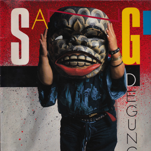
Perhaps the “packaging” for digital audio files is the Wikipedia entry, the MySpace page, and YouTube videos. If so, what’s missing is the actual promise of the old packaging. Many times I bought albums because the cover lured me in, not because I knew anything about the music. Often these records became favorites—an album of modern gamelan music with a short man wearing a huge mask on the cover, Amarcord Nino Rota, and Gal Costa’s “India” for example. Because I purchased them “sound unheard”—as opposed to hearing snippets online—I was invested in listening carefully to every note in order to decide whether I liked the music.

The ability to hear snippets of music online is both good and bad—good, because you can get an idea of the music; bad, because you don’t get the whole idea. You make judgments quickly, and often unfairly. Given this mode of quick decisions, perhaps what we ultimately listen to is actually much more limited than before, despite the actual availability of a greater range of music.

So maybe there’s a design challenge here—how can we add a visual element to an audio file that that lets our imagination go to work?