The Problem with Video in Museums
May 29th, 2012Maybe it’s my problem. I just can’t help imagining that most of the videos I see in museums were made with a beginning and an end. That is, that the intended experience is based on a linear immersion that takes place over time. Is it enough to see only a section or start with the end?
Maybe it’s because we’ve come to understand Art as encompassing such a large range of expressions, the only way we know how to anoint it is by sticking it in a museum. If that’s the case, should there be timed entry—like a movie theatre—to the spaces that are showing videos? As it stands, chances are that you will not arrive at the beginning.
The only video—actually I’ve seen only a part of it—that celebrates an unplanned arrival is Christian Marclay’s The Clock. The 24-hour-long video is keyed to the actual time of day through its constant showing of clocks of all types from hundreds of different movies.
I can’t imagine that the video-makers haven’t considered this issue. Maybe my short encounters are exactly what they’ve imagined. If this is the case, then I confess—I’m not that interested in a lot of what I’ve seen. Or am using the wrong yardstick, one based on a lifetime of movie-watching?
The 2012 Whitney Biennial
May 22nd, 2012I just saw the 2012 Whitney Biennial. The fourth floor was closed to get ready for K8 Hardy’s Untitled Runway Show, so I didn’t see any performances during my visit. What I did see was a lot of art so unsure of itself that it hedged its bets with lots of references to other works or masqueraded as agents of social change.
We appear to be at a point where there are clear rules for what constitutes “high†art. And I’m not just talking locally. Just look at any of the large, regularly occurring exhibitions around the world and—even if the names are unfamiliar—the language the art employs is not. Unfortunately, it feels like terms more dictated by a marketplace than a set of shared aspirations.
The fact that artists and art viewers are aware of what art is supposed to look like doesn’t mean that compelling work is not being made within that set of expectations—I just didn’t see much at the Whitney.
As an artist, perhaps the best takeaway from this visit is the inspiration to make something that really matters.
Origami Ukulele
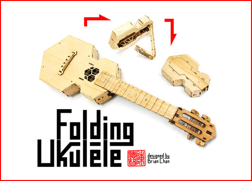
May 18th, 2012A freelance engineer who’s won awards for his mobile phone concept designs has taken his passion for origami and applied it to music. Brian Chan has invented a folding ukulele, made of laser-cut pieces of bamboo plywood. The engineering makes it even more portable than a normal ukulele. By disengaging the strings, one can fold the neck and headboard into the body of the instrument. The result—something that resembles a turtle—can be easily thrown into a pack. If you really want to connect with the design, there’s a kit available. Get details on where to buy it and watch him describe here.
The Search for Magic
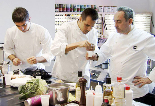
May 15th, 2012I just saw a film about a man driven by his desire to create and share new experiences in the dining room. Not yours, though—you had to go to his place to have his vision shared with you.
El Bulli: Cooking in Progress was about the Spanish chef Ferran Adrià and the restaurant located north of Barcelona that he led. It recently closed, and I suspect the intense quest for the new and unexpected probably wore out the man. His curiosity was responsible for changing how we think about the experience of eating—an opportunity for good-tasting nourishment and shared conversation, or, better yet, an orchestrated series of surprises and delight?
Adrià ’s pursuit of magic made it necessary to close the restaurant every year for six months for “research.†The kitchen staff would retire to Barcelona during the winter months to play with food, examining texture, taste, and presentation. The meticulously documented results were put into play upon their return and fine-tuned in the actual restaurant environment.
What made this all work was not just the intensity and focus of the man, but his willingness to experiment and look beyond the “rules†of the kitchen. I suppose the lesson is that we all need to be open to what lies outside the box—the potential rewards are too great to ignore.
[The movie site.]
Updating the terms
May 10th, 2012Time and Art
December 6th, 2011I’ve been thinking a bit lately about time and its relationship to different forms of art. Though I have never questioned the necessity of time for letting ideas unfold in music, film and theatre, I had never built that into the equation for painting, drawing and photography. My maintaining a position in front of a Degas, as other visitors to the Museum of Fine Arts rushed past, provided the opportunity to change that understanding.
In the past-paced world in which we live, one has few chances to “live†with things that don’t demand our attention. Because our environment is filled with images that constantly come and go, it’s hard to think of a two-dimensional piece of art as rewarding you in new ways when you give it some face time. If you resist the temptation to move on, a painting or drawing can reveal what a glance will not. Your own experience of discovery may even in some ways resemble the “story†found in a play or piece of music. I’m not talking about the implied text of a painting with recognizable elements. What I’m getting at is the recognition—in the language of the particular art form—that something has taken place. Perhaps with you.
Bring ’Em In And Keep ’Em There: Some Website Tips
November 15th, 2011Whether you’re in charge of a website that represents an individual, a small business, or a large corporation, there are certain approaches that will help make your website successful. Many people assume that the success of a website depends on the code that drives its performance. To a certain extent they are right, but if you don’t put some effort into thinking about a few things first, you’re probably bound to fail.
First, your site must be found for it to make any difference.
Second, you have about 4 or 5 seconds to convince a visitor that he or she is in the right place before they move on.
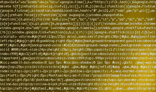
The smart use of search terms is very important to your site being found. Identifying them before you construct the site will enable you use these keywords as the file names of the pages—set up with dashes or underscores between words—which can be read by search engines.
It will also provide you with a good list of words that will help you write the pithy first paragraph for the homepage. Google and other search engines use special algorithms that pick up this text to qualify your site as an appropriate return on a search. They also use some of this text as an important part of the descriptions that support the links they deliver on the results page. This helps someone to decide which sites—typically out of a long list—to examine.
Links to your site from others also increase the chances that you will be seen as a better “answer†to a query than competing sites using the same keywords. Encouraging others to do this should be part of any search engine optimization strategy.
Once you’ve convinced someone to visit your site, you need to deliver a quick, coherent story for your target audience(s) to stick around. What’s the best way to do that?
1. A site’s look and feel broadcasts information about the nature of the site, so it’s important to get it right.
You have to employ the correct language or visitors will misunderstand who you are. For example, a corporation’s site should not look like that of a university. The visual language of the site also sends a message about the level at which the company or institution operates—a poorly designed website suggests that the “business†it represents might not be as professional as what a visitor is searching for.
Pay attention to these details, and you’re off to a great start.
2. The visual identity of the company or institution must be clear and not in conflict with the look of the site. Visitors will leave quickly if they are confused by what they see. There are many names that look and sound like others, so it’s important to provide the right context. For example, the homepages of the town of Harvard, Massachusetts and Harvard University both immediately indicate which “Harvard†it is.
3. The navigation should be labeled in such a way as to begin to tell a story. For example, if a major area on a company website is called “Case Studies,†one can assume that the business has a record of success, or they wouldn’t be providing stories about their work. Without exploring this section of the site, one could also guess that they view themselves as providing expertise in a number of areas. It might also be an opportunity for them to share the names of impressive clients. Of course, the names of the links in the main navigation should also operate in the original way they were intended—to organize the content in logical sections, describe the breadth of content on the site, and provide a quick way to get to a
particular page.
4. The homepage text must quickly explain the company or institution and describe what it does. This seems obvious, but many sites generalize here—you should resist the temptation to describe your business in the ambiguous terms of the undifferentiated taglines of many companies. Instead, provide focused and well-written paragraphs that help a visitor determine whether their problem or question is within the purview of the institution or company, and whether an answer to a particular question can be found on the site. And, as mentioned earlier, this approach will help your site be found in the first place.
