Flatbed Press at 25
Friday, November 4th, 2016
The University of Texas Press just published a book entitled Flatbed Press at 25. It provides a history of the founding and operation of Flatbed Press—a collaborative printshop located in Austin, Texas—with reproductions of prints and of artists and master printers working together. The press was started by Mark Smith and Katherine Brimberry twenty five years ago, and it is that milestone the book celebrates.
 Flatbed Press at 25 makes a strong case for the press’s importance with lots of visual evidence—we are treated to a quarter century’s worth of wonderful prints, arrived at through the open engagement of artists with master printers. And, as the book argues for Flatbed’s place in the national context, it reveals that the press has all along provided unique opportunities for artists connected with Texas in one way or another, furthering many careers over the years. In fact, it has even promoted them with their collection Flatbed Portfolio I, a set of prints by nine “Texas artists.â€
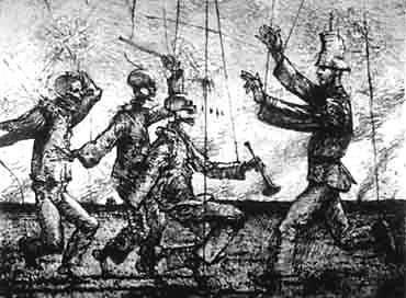
Robert L. Levers, Jr., “Victory: The Celebration,†intaglio print. 1991.
One reason—among many—that I am happy with this book is that it includes a section on my father, Robert L. Levers, Jr. The last print he ever made was done at Flatbed the year before he died—a huge soft-ground etching and drypoint work entitled Victory: The Celebration. It hangs in my office right behind me, and does not cease to call out to visitors or invite my own explorations of certain areas of the print during my workdays.
Nice to see a book that so lovingly provides insight into a unique studio and the artists that have spent valuable time there.
My father, the artist Robert L. Levers, Jr.
A number of years ago, I wrote a short history of my father’s artistic life. I’ve included it here:
Much of the imagery in my father’s last work would not look out of place in contemporary news reports. In fact, the paintings, prints and drawings—most inspired by a dream about the football stadium at the University of Texas under attack—could be said to be prescient in their focusing attention on themes which will surely be haunting us for some time to come.
Originally from the east coast, he spent his productive artistic life in Austin, Texas. Before he arrived to teach at the University of Texas, however, he studied at Yale, the art department of which was undergoing great change at the time—his undergraduate years provided not only something of a Beaux Arts experience, but also included study with Josef Albers, the former Bauhaus teacher and artist who developed the famous color course. A stint in the Navy between the two degrees helped pay for his graduate education, thanks to the G.I. Bill.
He was primarily known as a painter, but he produced work in a range of mediums, including drawings, prints, and at one point, constructions made of drawings in gouache on cutout pieces of wood arranged into scenes of conflict.
He made the most of sabbaticals—time spent in Mexico City not only exposed him to the Pre-Columbian art at the Anthropology Museum but also to the smog that hung in the former lakebed in which the city was founded, both of which affected the content of his work. In 1980, a National Endowment for the Arts Fellowship made possible a year in New York City focused solely on work and visits to galleries and museums. Four years later, he participated in the Venice Biennale as a representative of the United States, then traveled to Europe for the first time, spending four months viewing exhibits in many of the major cities of the continent while traveling with a beat-up suitcase dedicated to museum publications.
His work obliquely referenced the turmoil of current events, though at times the treatment of these themes seemed almost comical—it is that tension that animated some of his best works. In 1992, he died from a heart attack suffered in his garden. At the time, a retrospective of his work was traveling to different cities in Texas.
