Posts Tagged ‘graphic design’
Iranian Typography
Monday, February 21st, 2011
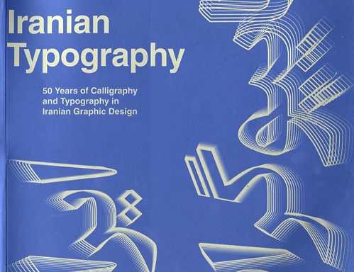
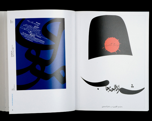
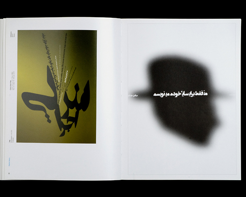
A recent posting on the imprint: EXPANDING THE DESIGN CONVERSATION blog calls our attention to a new book on Iranian typography. As a designer practicing in the United States, it’s often easy to forget about opportunities provided by letterforms different than the ones we use every day. A few years ago, I was lucky enough to see some posters—I believe from Iran, as well—at the Boston Center for the Arts’ Mills Gallery. Some of these took advantage of the idea of type as object—certainly not unfamiliar to audiences here—but with the calligraphic feel of the Persian characters, the effect was often profoundly different.
The catalog is the result of a relationship between Iranian designers and the Basel School of Design, showing 50 years of logo design and posters from the Iran. That’s a lot of history, especially when you consider that the first examples come from a very different world—one in which the country was under the rule of the Shah and much more connected to interests in the West. Looks like this book is worth a good look. More information from the publisher is here. Copies can be ordered from Amazon here.
3 Reasons Crowdsourcing a Logo is a Bad Investment
Wednesday, November 17th, 2010Most experienced graphic designers do not participate in open calls for logo designs. There’s a good reason why clients shouldn’t either.
1.You can count on your logo being developed by inexperienced designers. Because this process is seen as an opportunity for young people to build a portfolio, you’ll need to be concerned about potential problems from poorly executed solutions. Incorrectly formatted files that don’t print properly and logos illegible at certain sizes are just a few of the issues you might have to confront. Also, who will tell you that “looking good†doesn’t necessarily mean that it’s a good or appropriate design for your logo?
2. Your logo will be an isolated element, not really part of an integrated corporate identity. Applications of your logo are likely to be no more than a case of pasting it wherever it’s needed—and that’s not an identity. Designers that have a track record depend on more than their sense of design to deliver successful solutions. A familiarity with marketing strategy and the big picture—and asking the right questions—result in a successful and consistent approach that inexperience just doesn’t deliver.
3. The best designers will leave the field after a time because they can’t make a living based on this model. That’s bad for everyone. Our ability to communicate should not be based on the work of amateurs. This process is sometimes defended as a way for young people to get experience, but it’s not sustainable. When one gets paid for his or her thinking through competitions, then the effective hourly rate is pretty low. If this really were the smart use of “group intelligence,†as it has been heralded, then it wouldn’t be a competition, but cooperation instead—and that’s not what clients want to shell out for.
In short, you get what you pay for. If we continue to rely on this approach, after a time it will be hard to find the kind of expertise required to develop an identity that does its job effectively because the professionals will all be doing something else. (By the way, how do you like my writing?)
Signposts #6
Wednesday, November 3rd, 2010Matthew Carter, MacArthur Fellow
Tuesday, October 5th, 2010Matthew Carter is one of the 2010 recipients of a MacArthur Fellows award. It is well-deserved recognition for his particularly intelligent and graceful solutions to typographic problems, a good number of which did not even exist at the beginning of his career. (Ink on paper works quite differently than an rgb monitor.)
As a type designer, his contributions are often viewed in service of the work of graphic designers. However, without the “tools†he’s developed, much of what designers do would not be possible in the same way. His work reflects a thorough knowledge of traditional styles, yet is in sympathy with the 21st century. He is responsible for the designs of over 60 typeface families and 250 individual fonts, including many you know intimately, if not by name.
His notable designs include Bell Centennial, a face which allowed the telephone company to reduce the size of the type while retaining legibility; Verdanna and Georgia, THE legible faces of the web; and many of the preferred versions of classics like Baskerville and Caslon.
Carter sees this award from the MacArthur Foundation not as recognition for a successful career coming to a close, but rather as encouragement to keep going. I look forward to next chapter.


